|
|
Post by Cosmic on Jul 29, 2013 14:28:53 GMT -5
Ello there. With a new commission coming to me and after the success' of previous ones I thought I'd start to take that step into a more professional direction that I mentioned a while ago. With that, I've been thinking of first starting a Facebook page, nothing fancy, just something to get started, and so I needed a main picture/logo for a watermark. This is what I've been toying with for the past hour...  EDIT And just an idea how the watermark may look...  I haven't settled on anything yet, just thought I'd get some imput about the direction it's going. Is this a yes? Complete No No? Give me all you've got, IGMB. It's missing a lot at the moment, I've had to throw it together with GIMP, I haven't done any sort of logo or graphic design for the past 4 years, and even then it was just 2 weeks work experience! Please help me with this. As you may be able to tell, I've gone with the 'Cosmic' route since that is how most people know me. Cosmic |
|
|
|
Post by Trooper One-Nine-Seven-Four on Jul 29, 2013 15:07:42 GMT -5
Neat! However, I wonder if a different font might work better for the logo? Perhaps using the same font that was used for the titles in Battlestar Galactica, since that would tie into you monicker? Although I don't know how well that would scale down into a watermark...
|
|
|
|
Post by Adkenpachi on Jul 29, 2013 15:30:40 GMT -5
Heh, I'm almost the opposite... I think the water mark is good but the logo is a bit... pre-teen girly, not your target market  Try something darker, but not TOO dark... also more reds and blues rather than pinks and cyans. Hope this helps, no art programs anymore to mock anything up  |
|
|
|
Post by Cosmic on Jul 29, 2013 15:51:14 GMT -5
I hadn't thought of that, Adken! But now you mention it I agree! I'm quite partial to the elegant style of the watermark, so I think the font will stay. I will darken the logo down, I did actually start it off with a black space background with red and blue lights, maybe I will go back to that.
|
|
|
|
Post by BG. Foster on Jul 29, 2013 16:43:17 GMT -5
I think a water mark should go over the actual figure other wise there isn't much point. I could quite easily cut that off the image and give you no credit for it.
|
|
|
|
Post by Rook on Aug 1, 2013 11:42:54 GMT -5
Great idea for a Facebook page!
I'm with Adken on the look of that one. The one you've made makes me think of an astrologers get together or maybe a woman that reads palms.
I think a paint brush flying through space like a comet would be a great look. With the words "Cosmic's Workshop" over the brush.
|
|
|
|
Post by optimat on Aug 29, 2013 2:55:48 GMT -5
If you're still not decided on this I would love to help out. Will require a bit of chatting about the look you want to go for though, as I would prefer to start from the concept phase even if we actually end up with something not dissimilar from what you have produced. I can't say I've done graphic design professionally but at my workplace where a UI or application design has been required I have always been on the design team so I would hope to bring some help with combined efforts.  |
|
|
|
Post by Cosmic on Oct 26, 2013 16:27:52 GMT -5
Hi everyone.. After buying myself a graphics tablet I've been doodling quite a lot and I've turned something into a possible direction for a logo...  Thoughts? I'm preferring this to my original designs I have to say, it's more 'homemade' which I feel is nice. Optimat I really do apologize for not replying! I completely forgot about this thread and regret not replying to you. If this seems to be a good direction then I'd welcome everyone's input on this It's obviously still a rough and there will be more detail coming |
|
|
|
Post by Adkenpachi on Oct 26, 2013 19:07:21 GMT -5
The font is a bit dodgy.. looks really rough around the edges, needs softening.
|
|
|
|
Post by Cosmic on Oct 27, 2013 4:17:48 GMT -5
I can sort that out. So less 'bubblyness'?
|
|
|
|
Post by Adkenpachi on Oct 27, 2013 19:55:05 GMT -5
No, I mean smooth the edges, they're not feathered at all
|
|
|
|
Post by Rolling Thunder on Oct 28, 2013 19:01:54 GMT -5
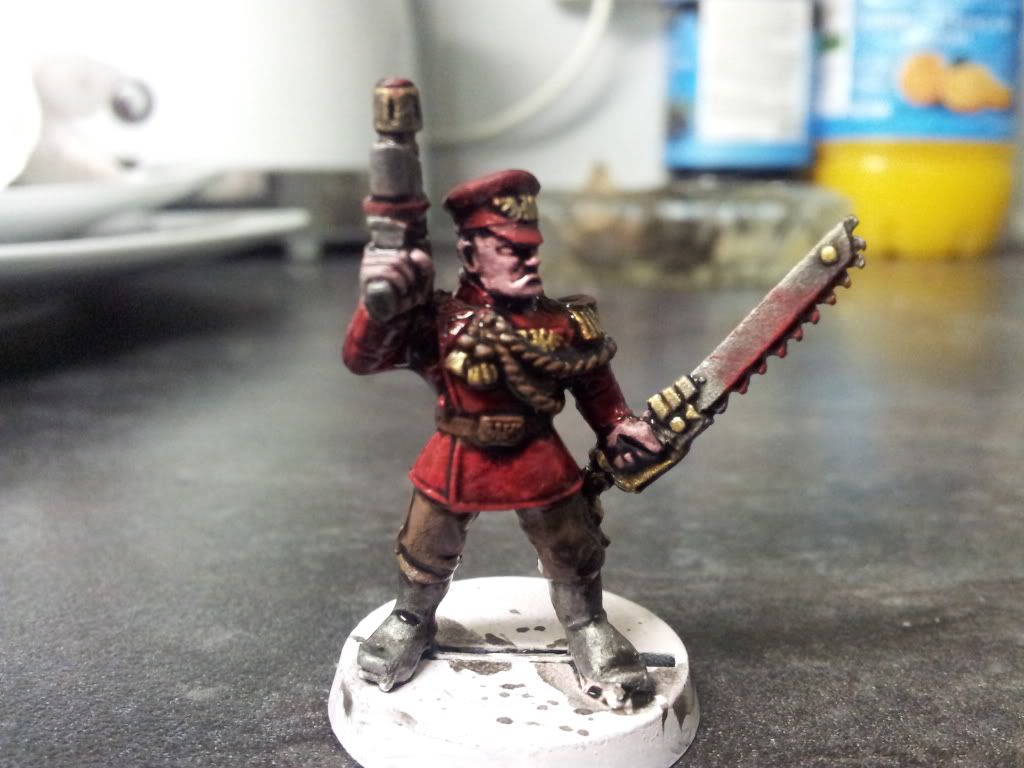
Can't use GW IP for your watermark.
|
|
|
|
Post by Boobs McGee, Esquire on Nov 4, 2013 17:06:31 GMT -5
I liiiike it!  |
|


 Try something darker, but not TOO dark... also more reds and blues rather than pinks and cyans.