|
|
Post by treadiculous on Jul 31, 2014 5:25:29 GMT -5
Hi, I am planning to make a piece of scenery which will join two large game tables together. It will be 6' long and feature a drop of about 6" from the upper table to the lower table, this will enable me to play beach landings etc. It will feature a number of ramps / steps for tanks and infantry. I will be using wood and maybe using pieces from the bastion kits.(which I don't own yet)... though I may get some wood laser cut or 3D print some defenses. Here are the two main designs I am thinking of using: (please note, these designs are drafts and are not in proportion or scale.. I will create those when I have a few more minutes spare!) Design 1: 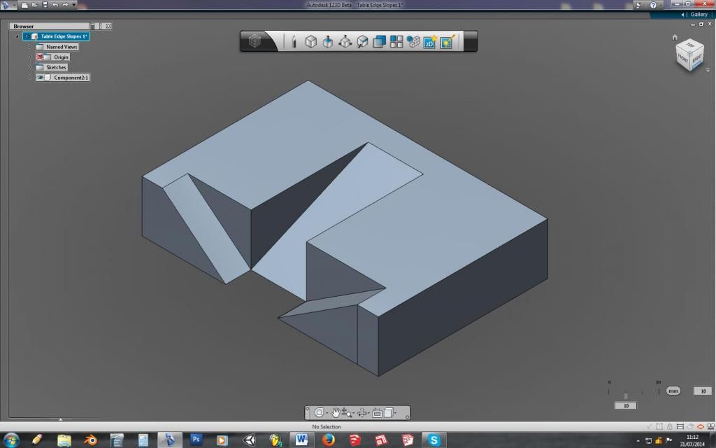 the further developed version of design 1: 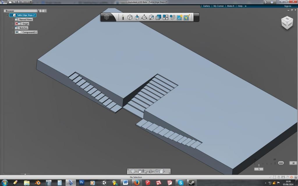 Design 2: 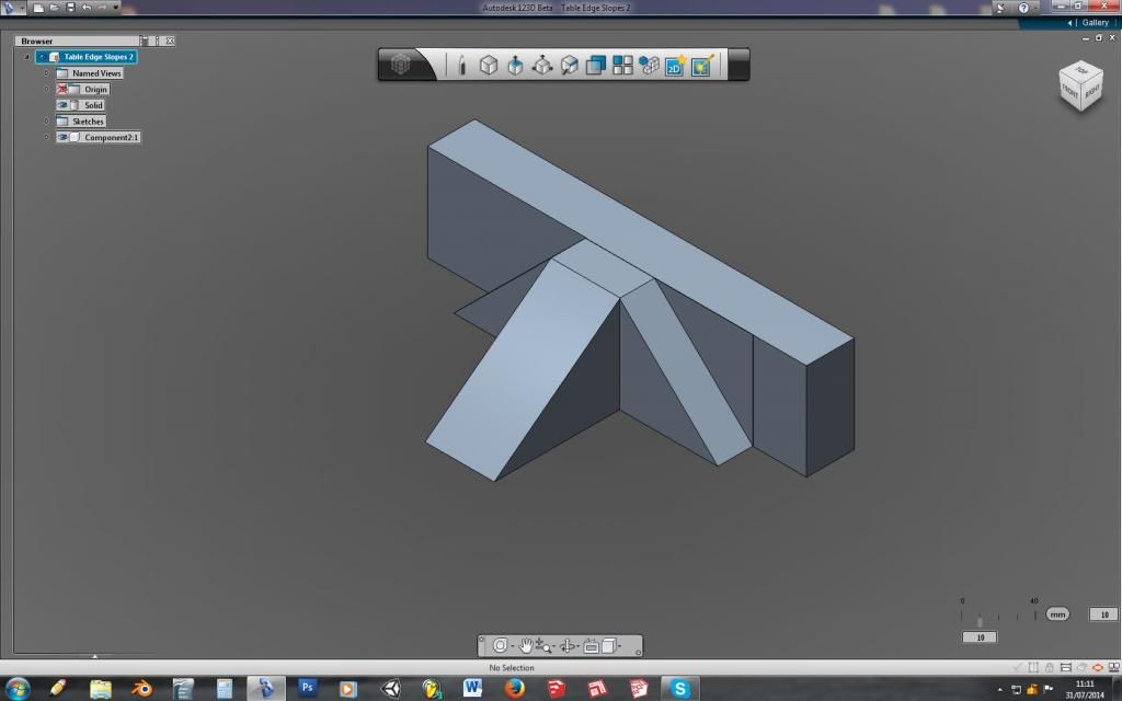 I will draft a finished version of this soon Both have advantages and disadvantages. Please vote and let me know your thoughts. I am considering additional layers of walkways to be added so will be welcome to any suggestions which you feel will make it more awesome. ...However, I also want it to take up as little storage as possible, so things must be able to dis-assemble, and be sturdy enough to handle my drunken packing away. |
|
|
|
Post by BG. Foster on Jul 31, 2014 8:54:15 GMT -5
I've voted for design one but I think it could do with some more work.
|
|
|
|
Post by treadiculous on Jul 31, 2014 13:02:51 GMT -5
oh yeah.. these are very much drafts.. not to scale or proportion.
Its interesting working out the different dynamics which would occur for attacker and defender with each lay-out.
|
|
|
|
Post by BG. Foster on Jul 31, 2014 13:22:04 GMT -5
Do you have photos of the 2 boards it'll be connecting?
|
|
|
|
Post by treadiculous on Jul 31, 2014 16:27:12 GMT -5
nope.. they're just big plywood boards painted grey... I'll have to work out how to elevate one of the boards to be the right height... that'll be the easy bit of the project! this thread on a different site has loads of inspiration: www.warseer.com/forums/showthread.php?196307-BaCon-2009-2-Months-20-Tables!-%28Warhammer-40k%29/page3 - the closest design to what I am planning is table 8: 'highway table'.. though my steps will run lengthways down one edge of the board and allow a second table to be attached to the step section. (I really love table 3: 'underground cavern' idea.. may have to work toward that since the current project will be giving me some elevation anyway...)) |
|
|
|
Post by Yeti's Yell on Jul 31, 2014 18:18:10 GMT -5
Both good ideas but I voted design one, simply for the real support that the physicality of the design would give to based models. The second is visually appealing and historically realistic too but might be a heart breaker for your models or even worse, your friend's models, as you invite them to play on the piece and the grade makes models simply fall off. Hard to even put placement markers on steep grades.
What grade do you plan on for the walkways? I suggest a few shallow grades separated by non-playable steps, a landing of sorts, each less than an inch or so in width but high enough to drop the whole gantry way over the length of the walk. That way between the grade and walls, models can keep position.
Good luck and thanks for allowing us to participate. Looking forward to more on this.
Best,
Yeti
|
|
|
|
Post by treadiculous on Aug 1, 2014 17:35:31 GMT -5
okay.. so I can see that my drafts are making you all think I was intending slopes, and that you were looking at the designs as though the steepness of the slopes in the desings was to be representative of the final product. That is my error! I have had time to re-make design 1 to look more like what I intend: (please consider that design 2 would also feature steps and more gentle slopes until I get the time to re-design it too). 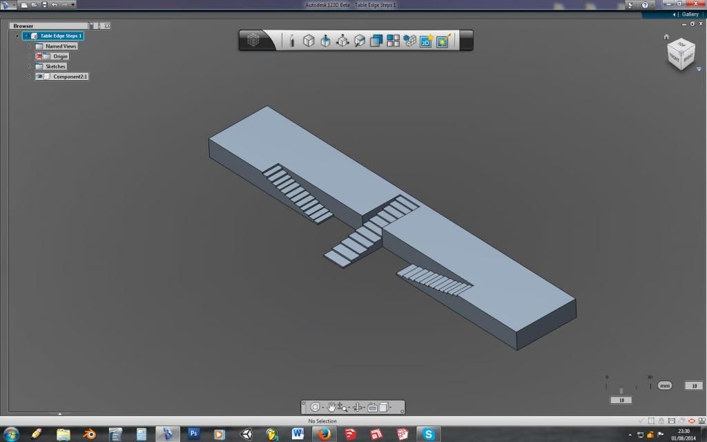 This would cover a length of 6' and the difference in height would be somewhere around 6" or 9". I'm in favour of more height so I can later put some tunnels beneath the upper layer. ---- edit --- I have noticed that the central stairs on the original design 1 are flush with the wall, the new design has the stairs coming forward of the wall... I shall amend this soon. |
|
|
|
Post by treadiculous on Aug 5, 2014 4:44:32 GMT -5
so.. design one is now this:  |
|
|
|
Post by BG. Foster on Aug 5, 2014 14:05:46 GMT -5
I like it!
|
|
|
|
Post by treadiculous on Aug 5, 2014 18:36:23 GMT -5
after a discussion with empty this version was considered... giving more tactical options and thus making it harder to defend. It also combines elements of both version one and two. 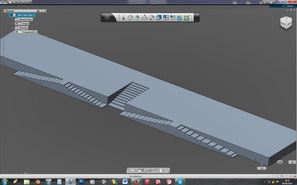 |
|
|
|
Post by BG. Foster on Aug 6, 2014 1:27:23 GMT -5
Hmmm, not sure. Think I prefer the last one.
|
|