Deleted
Deleted Member
Posts: 0
|
Post by Deleted on Mar 16, 2008 23:45:39 GMT -5
|
|
|
|
Post by mardaddy on Mar 17, 2008 0:11:22 GMT -5
Welcome out of lurk mode.... My Kasrkins was the first completed paint jobs I ever posted on these boards too! A lot of different things you can do to experiment to get the best pics possible... Try taking your pictures outside, while in direct overhead sunlight. or use a white area & backdrop ( just a couple of pieces of copier paper and support with some books can do the trick - make sure the backdrop is at least 8in away.) Experiment with distances, macro settings light placement, flash and such. It's a given you'll end up taking a lot of photos til you find the right combinations that work for your particular camera, but nothing worthwhile comes easy anyways, and the results will speak for themselves.  |
|
|
|
Post by Commissar on Mar 17, 2008 1:28:37 GMT -5
Very nice from what I can see. I love em!  Lookin good, keep it up! |
|
|
|
Post by rarves on Mar 17, 2008 6:56:01 GMT -5
Cool, is that the same scheme your meat shields have? because I'd like to see them.
|
|
Deleted
Deleted Member
Posts: 0
|
Post by Deleted on Mar 17, 2008 7:32:19 GMT -5
As of this moment, my meat shields have a different scheme (black armour with dark grey fatigues) but I'm not sure if I'm going to keep them that way or not. I only have about 15 of them painted up, so it's really now or never to change them. I know my Hardened Veterans will have a similar scheme when I get around to converting them though.
|
|
Deleted
Deleted Member
Posts: 0
|
Post by Deleted on Mar 17, 2008 13:20:28 GMT -5
|
|
|
|
Post by rarves on Mar 17, 2008 13:35:11 GMT -5
Cool, I go with the Codex gray fatigues and black armor. Cool HW teams.
|
|
|
|
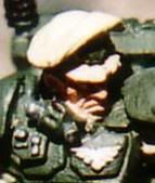
Post by Turtleboy(AWOL) on Mar 17, 2008 16:32:20 GMT -5
the two things I said outloud to myself when looking at your second whack of pics were 'wow' and 'that's f**kin cool'.
nice work on your minis! the only constructive criticism I might add is that it's relatively quick to take a lighter shade of green and go thru and highlight the armor plates along the edges where you think light would hit on your dudes. due to your use of DA green (that's what it looks like you're using for your stormtroopers - correct me if I'm wrong) you may have to take some white and just put a drop of white and a drop of DA green on a piece of paper then mix em together with your brush to get a perfect highlight color. blending colors on a pallete is a really cool thing to get into..I took a break from painting for a while and let my friend borrow my dwarf flesh - started painting again and was tearing my house apart to find it, finally called him and was like 'you got this?' ..anyway, long story short...sat back down at my painting table chuckling and busted out some light brown and elf flesh (the light flesh tone color) and just mixed up some dwarf flesh which allowed me to carry on and finish the model w/ no probs.
anyway, I really dig the models - dropping 20min into highlighting their armor when you're bored some time would really make them pop though I'd bet ^_^
|
|
Deleted
Deleted Member
Posts: 0
|
Post by Deleted on Mar 17, 2008 20:09:14 GMT -5
Thanks for the compliments and criticism TB.
I haven't actually highlighted them because I was waiting to just buy Catachan Green or Snot Green to highlight it manually, but for me to get to the hobby shop here is about an hour and a half of busing =\ I'll give the mixing a shot though, I guess I didn't think to do that because I'm a lazy arse when it comes to painting.. especially now that I'm debating my colour scheme in general.
|
|
|
|
Post by Turtleboy(AWOL) on Mar 18, 2008 3:18:00 GMT -5
ah yeah, the great debate about color scheme. I'll tell you what, from experience, if I didnt love my main guard armies color scheme and just the general quality/cool look of the models as much as I do I woulda quit the army long ago.
color scheme is really important. my first army was dark angels (same green you're using) and after a while they really seemed 'crayola-ish' colorwise. they had more and more of a 'game piece' feel and seemed less and less realistic. there's a huge difference between DA green and catachan green. my IG (catachan green) have always had that gritty realistic feel that has really endeared me to them, even when I've lost miserably for months at a time.
I highly endorse your wisdom in pausing to make sure your colors are just right.
|
|